Using Google Trends
Table of Contents
The gtrendsR package allows the user to easily query the Google Trends API and extract relevant data. But one of the issues with Google Trends has always been that the user is limited to 5 queries at a time, with the results scaled on a relative 0-100 scaling. Swap out/in a new term and the results for the other queries will also change relative to the new term, particularly if the new term is the most popular.
The workaround suggested for this was always to include the same reference term in the search, and then just drop it from the analysis afterwards. This way, all values are scaled consistently against that reference term (for example here using “france” as the reference term included). This can work, but inclusion of popular terms can also swamp the results for other terms that are potentially niche.
For example, if I run a two query search for the topics below - “soy milk” and “almond milk” - I can see that almond milk is far more popular.
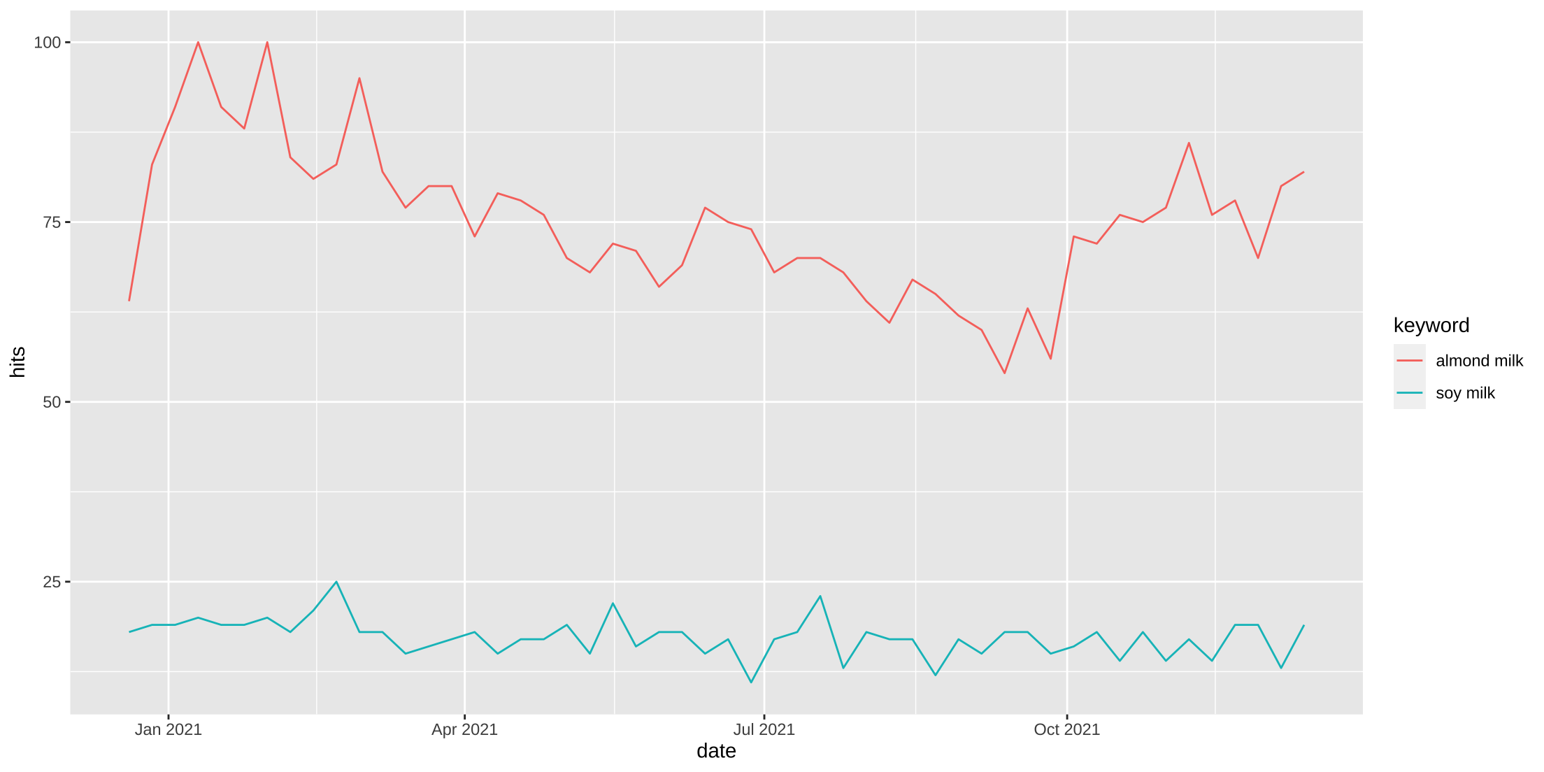
But if I’m interested in trends, I’m not solely interested in the level form popularity of a query. Instead, I may be interested in actual trend for the search, which is far more informative as to the changes in attention or interest of a topic over time. Yes, almond milk may be more popular than soy milk, but is interest in it declining or increasing over time, and to what extent are those changes more or less intense than, for example, soy milk?
Rather then looking at the level form results, if we instead standardize our data using z-scores all series are on the same scale and we no longer need a reference category. Our results are consistent, regardless of the other search terms or topics included in our queries. I can now run as many queries, with any number of terms/topics, and I can always get them onto the same scaling.
Below is an example. First, we run a search for a single search query - “soy milk”. Then we’ll run a second trend search with two queries - “soy milk” and “almond milk”. Because “almond milk” is a more popular search, the level form results of “soy milk are considerably dampened.
Query the trends API
pacman::p_load(tidyverse, janitor, here, glue, gtrendsR)

soy1 <- gtrend(keyword = "soy milk", geo = "US",
               time = "today 12-m", gprop = "web")$interest_over_time %>%
  mutate(group = "1 term")

soy2 <- gtrend(keyword = c("soy milk", "almond milk"), geo = "US",
               time = "today 12-m", gprop = "web")$interest_over_time %>%
  mutate(group = "2 term")

soy1 %>%
  bind_rows(filter(soy2, keyword == "soy milk")) %>%
  ggplot(aes(x = date, y = hits, group = group, col = group)) +
  geom_line() +
  labs(x = NULL, y = NULL,
       title = "Google Trends results for Soy Milk",
       subtitle = "`2 term` also included Almond Milk as a term")
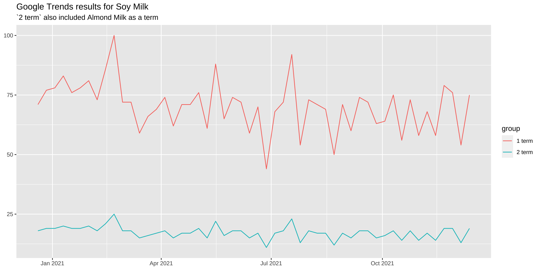
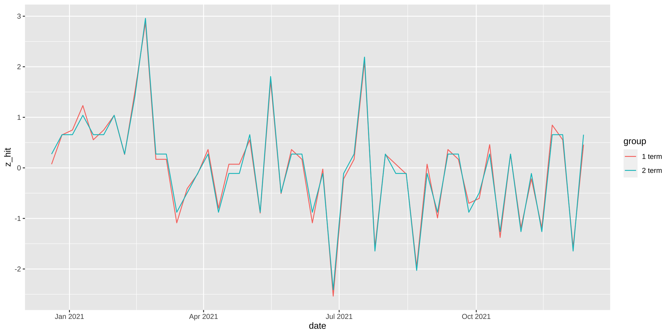
When we place the results of each search on the same plot we can see how the presence of “almond milk” as the reference group pushes down the results of the 2 term search. But while the levels are different, indicating search popularity, the week-to-week changes in interest are consistent. And, they’re effectively equivalent to each other - the single term search has more variance, but that’s only because the mean level is larger. We can see this when we standardize our data (value - mean(series)/sd(series)).
soy1 %>%
  bind_rows(filter(soy2, keyword == "soy milk")) %>%
  group_by(group) %>%
  mutate(z_hit = scale(hits)) %>%
  ggplot(aes(x = date, y = z_hit, group = group, col = group)) +
  geom_line()
Category trends
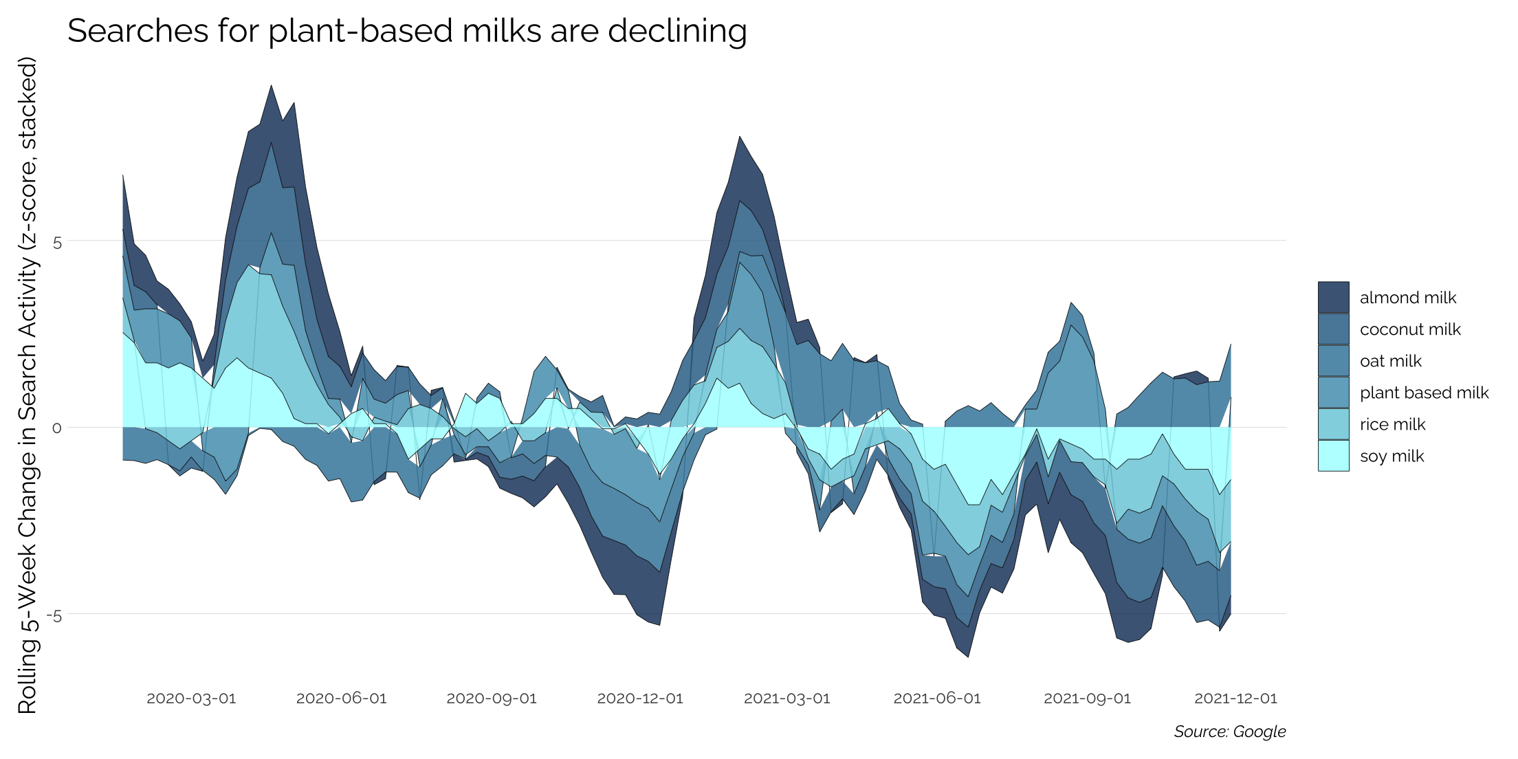
Let’s look at change in interest over time across the plant-based milk category. We’ll run multiple searches for various milk types and we’ll also include a category reference for “plant based milk” to see if the broad category search is experiencing the same changes over time.
Because trend data is noisy at a weekly level, we’ll compute a 5-week moving average, which we’ll then standardize.
soy_a <- gtrends(keyword = c("soy milk", "almond milk", "coconut milk", "rice milk"),
                geo = "US",
                time = "today+5-y",
                gprop = 'web')$interest_over_time

soy_b <- gtrends(keyword = c("oat milk", "plant based milk"),
                geo = "US",
                time = "today+5-y",
                gprop = 'web')$interest_over_time

soy_full <- bind_rows(soy_a, soy_b) %>%
  group_by(keyword) %>%
  filter(date >= "2020-01-01") %>%
  mutate(ma5 = zoo::rollmean(hits, k = 5, fill = NA),
         zma = scale(ma5))

soy_full %>%
  ggplot(aes(x = date, y = zma, group = keyword, fill = keyword)) +
  geom_area(stat = "identity",
            color = 'black',
            size = .15,
            alpha = 0.85)
Interpreting the results
Interpretation is now based on the period to period change in search with the y-axis capturing the magnitude of the increase or decline in search interest. The plot is an area plot, which is similar to a stacked bar chart - the results for each are not additive.
In 2020, the left end of the graph picks up a positive shift in interest in January as people make their New Year’s resolutions. There’s another large bump in interest in mid-spring before interest stabilizes in the summer. By winter 2020, interest was declining for just about every type of plant-based milk as people were probably much more interested in their holiday calories over health.
2021 sees the same shift in interest after New Year’s, but rather than stabilizing in the summer like in 2020, the 2021 search trends are going negative for almost every type of milk, with the exception of Oat Milk and broad “plant based” searches all other milk types are underwater. Whether this is due to people having more knowledge about the category and needing to search less often or if it’s a loss of interest in the products/category is not answered by trends data, but it would be interesting to see the velocity of category growth in the back half of 2021.