Mapping in R
State Level Maps
Looking at the Housing Price Index from the Freddie Mac.
Get the data
Use the data.table package to read in the HPI data (it’s faster than read_csv()), but then immediately convert it to a dataframe to clean it with dplyr. We’re also going to use the tidyquant package for CPI data and then we’ll read in the delineation files from the Census Bureau.
pacman::p_load(tidyverse, httr, urbnmapr)
# get state data set from urbnmapr package
data(states)

# download house price data (Freddie Mac)
dt <- data.table::fread("http://www.freddiemac.com/fmac-resources/research/docs/fmhpi_master_file.csv")
# get CPI data (FRED)
df_cpi <- tidyquant::tq_get("CUUR0000SA0L2",get="economic.data",from="1975-01-01")
# get delineation file (use April 2018 version)
url1 <- "https://www2.census.gov/programs-surveys/metro-micro/geographies/reference-files/2020/delineation-files/list1_2020.xls"
GET(url1, write_disk(tf <- tempfile(fileext = ".xls")))
df <- read_excel(tf,skip=2) #read in data from third row
# get rid of colname spaces
colnames(df) <- gsub('([[:punct:]])|\\s+','_',names(df))

# Put it together ---------------------------------------------------------
dt <- dt %>% data.frame() %>%
  mutate(date = as.Date(paste0(Year,"-", Month,"-" ,"1"))) %>%
  left_join(df_cpi) %>%
  group_by(GEO_Name, GEO_Type) %>%
  mutate(real_hpi = 100*Index_SA/first(Index_SA) / (price/first(price))) %>% # create real house price index
  ungroup()

dt2 <- dt %>%
  filter(date == max(date) & GEO_Type == "State") %>%
  left_join(states, by = c("GEO_Name" = "state_abbv"))

dt3 <- dt %>%
  filter(date == max(date) & GEO_Type == "CBSA") %>%
  left_join(df, by=c("GEO_Code"="CBSA_Code"))
State map
Look at the increase in prices in the Pacific Northwest…
# graph
ggplot(subset(fred$dt2, GEO_Name != "DC"),
       mapping = aes(long, lat, group = group, fill = log(real_hpi))) +
  geom_polygon(color = "#ffffff", size = 0) +
  coord_map(projection = "albers", lat0 = 39, lat1 = 45) +
  viridis::scale_fill_viridis(option = "E",
                              breaks=c(log(50),log(100),log(200),log(400)),
                              labels=c("-50%","0%","+100%","+200%"),
                              limits=c(log(50),log(400))) +
  theme_twg(grid = FALSE) +
  theme(legend.title = element_text(),
        axis.text.x = element_blank(),
        axis.text.y = element_blank(),
        legend.key.width = unit(.2, 'in'),
        legend.position = "right") +
  labs(x = "", y = "",
       title = "The coasts have gotten more expensive",
       caption = "Freddie Mac House Price Index by State,\ndeflated by US BLS, Consumer Price Index",
       fill = "Real House Price Growth\nSince Jan 1975")
## Warning: Using `size` aesthetic for lines was deprecated in ggplot2 3.4.0.
## ℹ Please use `linewidth` instead.
## This warning is displayed once every 8 hours.
## Call `lifecycle::last_lifecycle_warnings()` to see where this warning was generated.
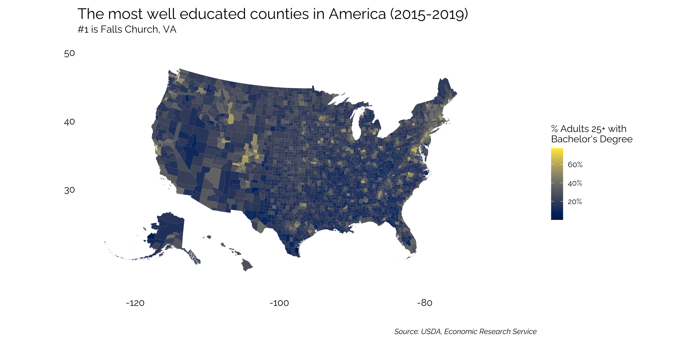
Mapping at the County Level
Here, we’ll use educational achievement data from the USDA. Again, using the urbnmapr package to bring in the shapefile data.
Read in the data
# get the data and clean
data(counties)
url1 <- "https://www.ers.usda.gov/webdocs/DataFiles/48747/Education.xls?v=1754.5"
httr::GET(url1, httr::write_disk(tf <- tempfile(fileext = ".xls")))
ed <- readxl::read_excel(tf,skip=4) %>%
  janitor::clean_names()
Joining by the “counties” shapefile rather than “states” and doing so within the pipe.
ed %>%
  select(fips_code, state, area_name, percent_of_adults_with_a_bachelors_degree_or_higher_2015_19) %>%
  inner_join(counties, by = c("fips_code" = "county_fips")) %>%
  ggplot(mapping = aes(long, lat, group = group, fill = percent_of_adults_with_a_bachelors_degree_or_higher_2015_19)) +
  geom_polygon(data = states, aes(long, lat, group = group), fill = "#f0f0f5", color = "white",
               size = 0) +
  geom_polygon(color = "#ffffff", size =0) +
  coord_map(projection ="albers", lat0 = 39, lat1 =45) +
  viridis::scale_fill_viridis(option = "E",
                              breaks = seq(20,100,20),
                              labels = c("20%","40%","60%","80%","100%")) +
  theme_twg(grid = FALSE) +
  theme(legend.title = element_text(),
        axis.text = element_blank(),
        legend.key.width = unit(.2, 'in'),
        legend.position = "right") +
  labs(x = "", y = "",
       title = "The most well educated counties in America (2015-2019)",
       subtitle = "#1 is Falls Church, VA",
       caption = "Source: USDA, Economic Research Service",
       fill = "% Adults 25+ with\nBachelor's Degree")
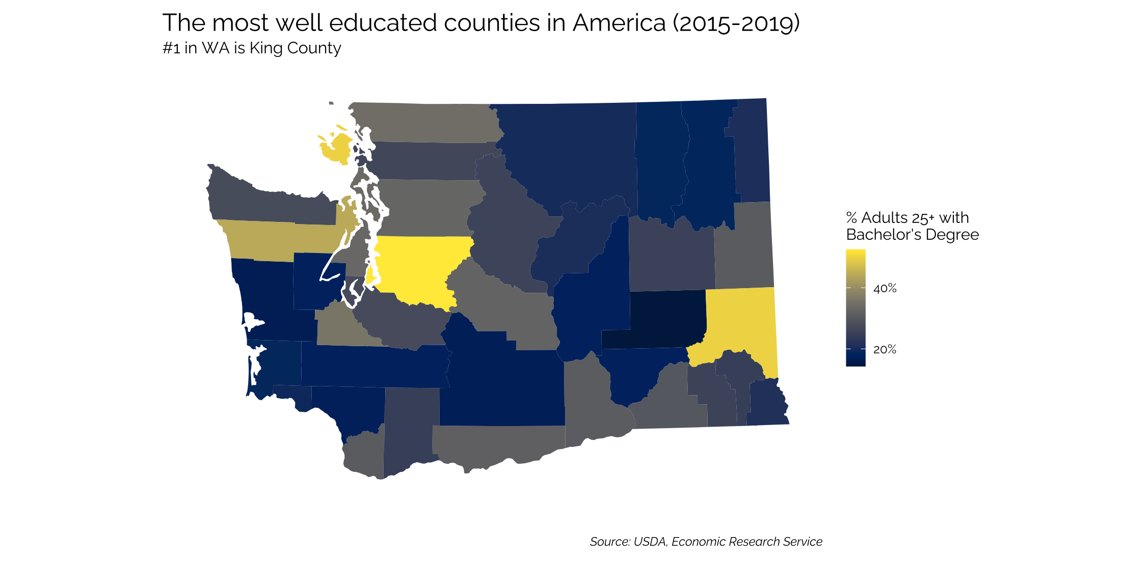
Mapping a Single State at County Level
To map a single state, filter the dataset and the geom_polygon
ed %>%
  select(fips_code, state, area_name, percent_of_adults_with_a_bachelors_degree_or_higher_2015_19) %>%
  inner_join(counties, by = c("fips_code" = "county_fips")) %>%
  filter(state_name == "Washington") %>%
  ggplot(mapping = aes(long, lat, group = group, fill = percent_of_adults_with_a_bachelors_degree_or_higher_2015_19)) +
  geom_polygon(data = subset(states, state_name == "Washington"), aes(long, lat, group = group), fill = "#f0f0f5", color = "white",
               size = 0) +
  geom_polygon(color = "#ffffff", size =0) +
  coord_map(projection ="albers", lat0 = 39, lat1 =45) +
  viridis::scale_fill_viridis(option = "E",
                              breaks = seq(20,100,20),
                              labels = c("20%","40%","60%","80%","100%")) +
  theme_twg(grid = FALSE) +
  theme(legend.title = element_text(),
        axis.text.x = element_blank(),
        axis.text.y = element_blank(),
        legend.key.width = unit(.2, 'in'),
        legend.position = "right") +
  labs(x = "", y = "",
       title = "The most well educated counties in America (2015-2019)",
       subtitle = "#1 in WA is King County",
       caption = "Source: USDA, Economic Research Service",
       fill = "% Adults 25+ with\nBachelor's Degree")
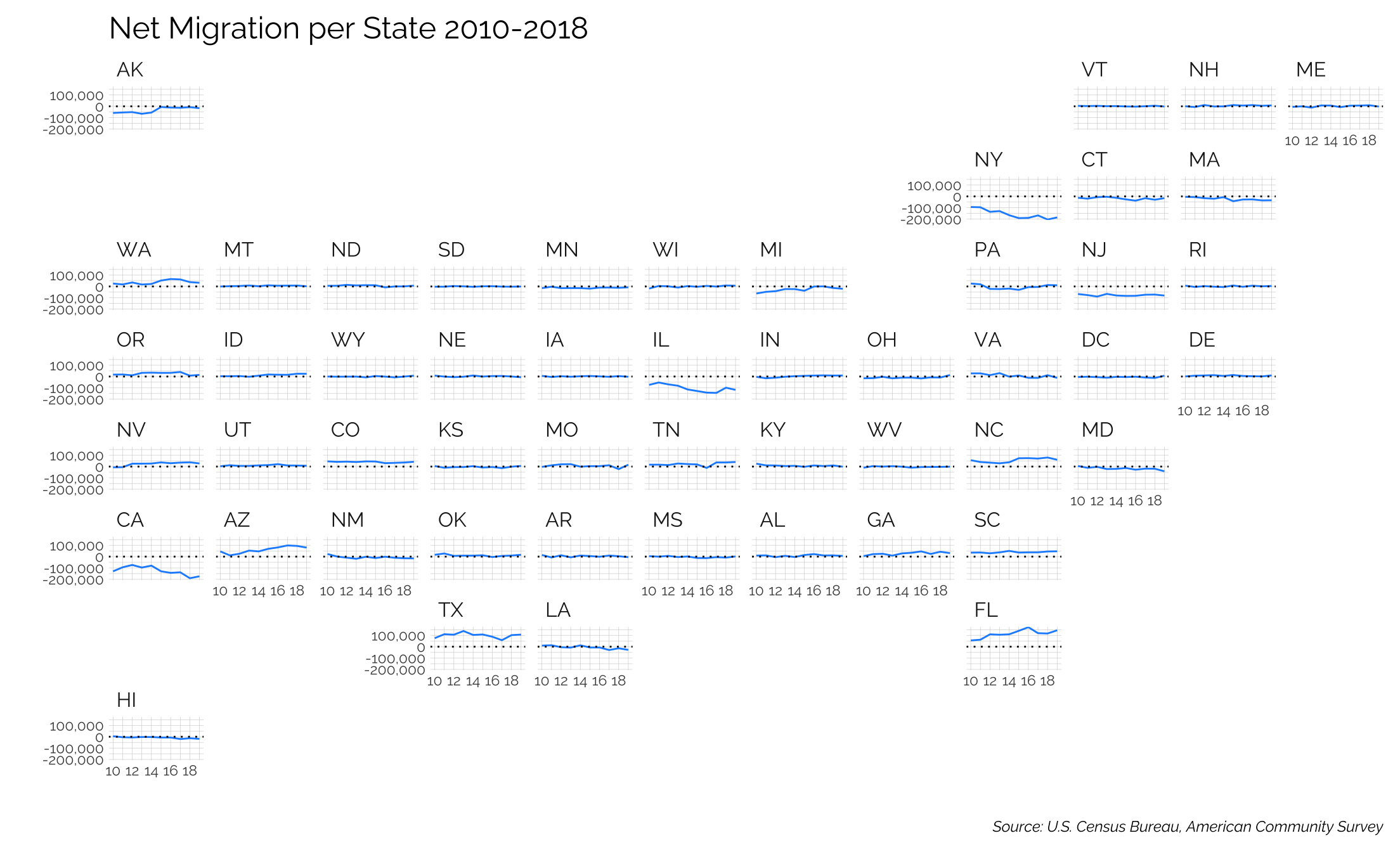
Geofacet Maps
The geofacet package is sort of fun to see a dataset for each state either over time or in some interesting way. In this case, we’ll map the net migration flows from each state from 2010-2018.
The first thing we’re going to do is build a dataset of migration flows, getting our data from the Census Bureau. The function to pull the data is below - it reads in each year’s data from the census website and pulls out the relevant data.
### State by state Migration ###
migration_pull <- function(year) {

  pacman::p_load(tidyverse, httr, readxl, glue)
  if (year <= 2013) {
    url1 <- glue("https://www2.census.gov/programs-surveys/demo/tables/geographic-mobility/{year}/state-to-state-migration/state_to_state_migrations_table_{year}.xls")
  } else {
    url1 <- glue("https://www2.census.gov/programs-surveys/demo/tables/geographic-mobility/{year}/state-to-state-migration/State_to_State_Migrations_Table_{year}.xls")
  }

  print(year)
  GET(url1, write_disk(tf <- tempfile(fileext = ".xls")))

  df <- readxl::read_excel(tf,skip=6) %>%
    janitor::clean_names() %>%
    filter(!is.na(x1)) %>%
    select(-c(x2:x7)) %>%
    rename(state = x1, inflow = total_8) %>%
    select(-starts_with('x')) %>%
    select(state:wyoming) %>%
    slice(c(1:53)) %>%
    filter(!str_detect(state, "Current"))

  names(df)[3:ncol(df)] <- df$state[2:nrow(df)]

  outflow <- df %>%
    slice(1) %>%
    select(Alabama:Wyoming) %>%
    gather(state, outflow)

  migration <- df %>%
    select(state, inflow) %>%
    left_join(outflow) %>%
    filter(!str_detect(state, "United States")) %>%
    mutate_at(vars(c("outflow", "inflow")), as.numeric) %>%
    mutate(net = inflow - outflow,
           year = year)
  return(migration)
}

years <- seq(2010,2019,1)

migration <- years %>%
  map_df(migration_pull)
Note the major losses in NY, NJ, CA, and IL while AZ, TX, and FL are really growing.
library(geofacet)
ggplot(migration, aes(x=year, y = net, ymin = 0, ymax = net)) +
  geom_line(color = "dodgerblue") +
  geom_hline(yintercept = 0, col = "black", linetype = "dotted") +
  facet_geo(~state, grid = "us_state_grid2", label = "code") + # abbrevation rather than name
  scale_x_continuous(breaks = seq(2010,2018,2),
                     labels = seq(10,18,2)) +
  theme_twg() +
  theme(axis.text = element_text(size = rel(0.75))) +
  hrbrthemes::scale_y_comma() +
  labs(title = "Net Migration per State 2010-2018",
       caption = "Source: U.S. Census Bureau, American Community Survey",
       y = "", x = "")
## Warning: The `size` argument of `element_line()` is deprecated as of ggplot2 3.4.0.
## ℹ Please use the `linewidth` argument instead.
## This warning is displayed once every 8 hours.
## Call `lifecycle::last_lifecycle_warnings()` to see where this warning was generated.
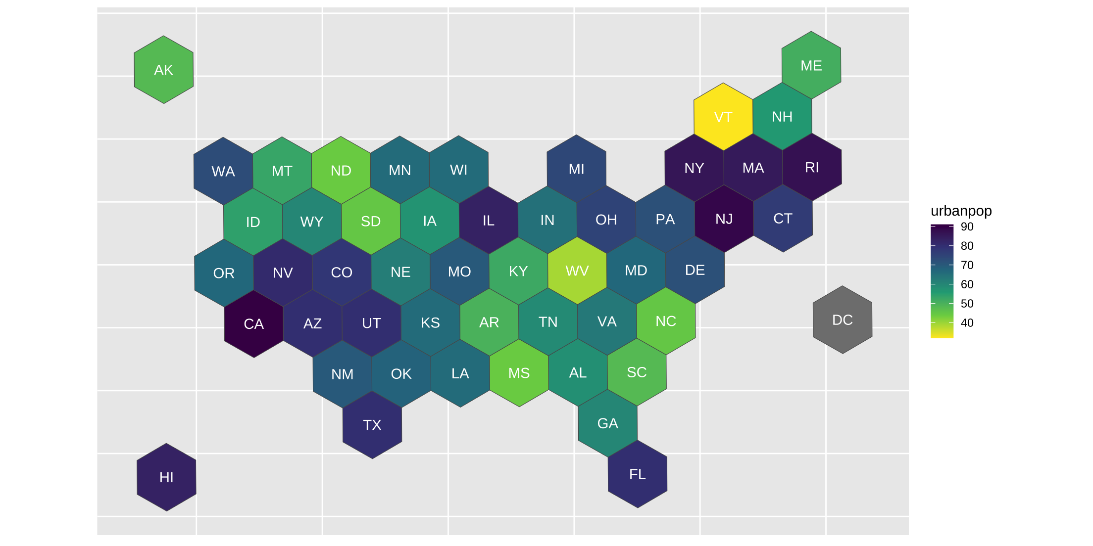
Hexbins
Another fun way of mapping data is with hexbins. The old way of doing this no longer works since it relied on rgdal and rgeos, both of which were sunsetted in 2023.
Originally, we were getting the hexbin data from here. Now we’ll pull from another github page in the code below.
pacman::p_load(tidyverse, here, sf)

# download hexbin map from github
# https://github.com/donmeltz/US-States---Hexbins
# map_path <- "https://raw.githubusercontent.com/donmeltz/US-States---Hexbins/master/GeoJSON/US_HexBinStates_EPSG4326.geojson"
# download.file(map_path, here("hexbinstate.geojson"))

# read as sf map of hexbin
sf_state <- read_sf(here("static","data","hexbinstate.geojson")) |>
    set_names(str_to_lower) |>
    mutate(region = str_to_lower(name))

# find centroid
centers <- st_centroid(sf_state) |>
    st_coordinates() |>
    as_tibble() |>
    set_names(str_to_lower)
## Warning: st_centroid assumes attributes are constant over geometries
df_center <- tibble(abbr = sf_state$code) |>
    bind_cols(centers)


# data to diplay
# default dataset by state

state_dict <- tibble(state = state.name, abb = state.abb)
arrests <- USArrests |>
    rownames_to_column("state") |>
    as_tibble() |>
    set_names(str_to_lower)

df_state <- state_dict |>
    inner_join(arrests, by = "state")

# draw map
dfa <- df_state |>
    mutate(region = str_to_lower(state)) |>
    right_join(sf_state, by = "region")

# with labels
dfa |>
  ggplot() +
  geom_sf(aes(fill = urbanpop, geometry = geometry)) +
  geom_text(data = df_center, aes(x, y, label = abbr), color = "white") +
  scale_fill_viridis_c(direction = -1) +
  theme(axis.ticks = element_blank(),
        axis.text = element_blank(),
        axis.title = element_blank())
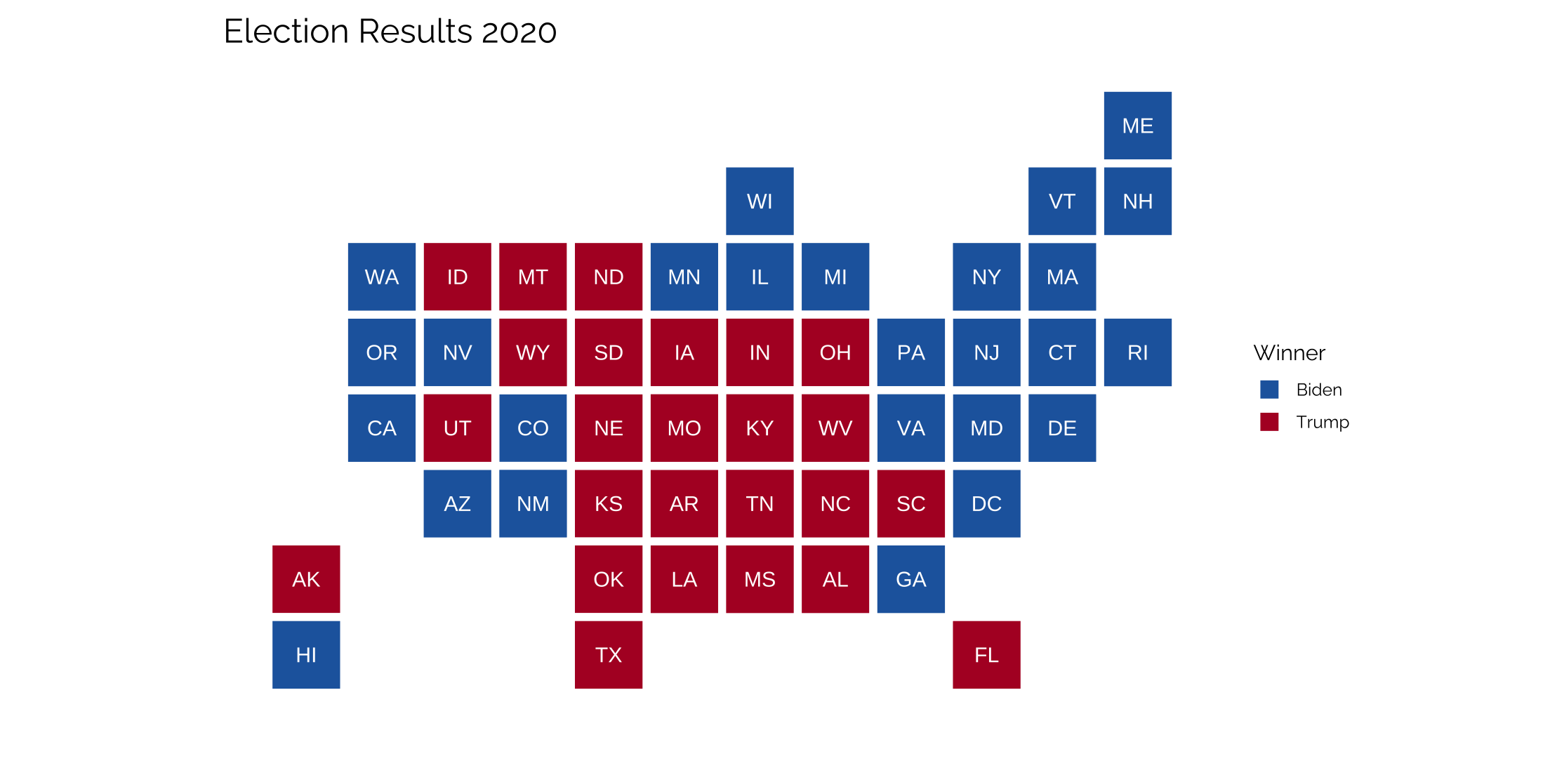
Statebins
Easy graphing with the statebins package github.com/hrbrmstr/statebins, which are really clean. All that’s needed is one column with the state names and another with the value that’s being passed through. Colors are controlled with a brewer_pal command that relies on the RColorBrewer palettes.
library(statebins)
url <- "https://www.archives.gov/electoral-college/2020"
site <- read_html(url)

site %>%
  html_nodes(xpath = '/html/body/div/div/div[2]/div/div/div/div[1]/div[1]/section/table[2]') %>%
  html_table(header = FALSE) %>%
  flatten_df() %>%
  slice(-c(1:2)) %>%
  select(X1, Biden = X3, Trump = X4) %>%
  mutate(across(Biden:Trump, as.numeric),
         across(Biden:Trump, ~ifelse(is.na(.), 0, .)),
         X1 = str_replace_all(X1, "\\*", "")) %>%
  gather(candidate, ec, 2:3) %>%
  group_by(X1) %>%
  filter(rank(-ec) == 1)  %>%
  filter(X1 != "Total") %>%
  mutate(value = candidate,
         state = X1) %>%
  statebins(
    font_size=4, dark_label = "white", light_label = "white",
    ggplot2_scale_function = scale_fill_manual,
    name = "Winner",
    values = c(Biden = "#2166ac", Trump = "#b2182b")
  ) +
  theme_twg(grid = FALSE) +
  theme(axis.text.x = element_blank(),
        axis.text.y = element_blank()) +
  labs(title = "Election Results 2020",
       x = "", y = "")
Working with shape files
Just generally, how to import and work with shape files and ggplot. In this case, we’ll download the latest shapefiles for US congressional districts.
pacman::p_load(tidyverse, sp, rgdal, rgeos)

# create a local directory for the data
localDir <- here("static", "data", "my_gis_data")
if (!file.exists(localDir)) {
  dir.create(localDir)
}

# download and unzip the data (this is the US congressional districts)
url <- "https://www2.census.gov/geo/tiger/GENZ2020/shp/cb_2020_us_cd116_500k.zip"
file <- paste(localDir, basename(url), sep='/')
if (!file.exists(file)) {
  download.file(url, file)
  unzip(file,exdir=localDir)
}
Now that the data is downloaded, we can start to work with it.
# create a layer name for the shapefiles (text before file extension)
layerName <- "cb_2020_us_cd116_500k"

# read data into a SpatialPolygonsDataFrame object
dataProjected <- readOGR(dsn=localDir, layer=layerName)

# add to data a new column termed "id" composed of the rownames of data
dataProjected@data$id <- rownames(dataProjected@data)

# create a data.frame from our spatial object
congPoints <- fortify(dataProjected, region = "id")

# merge the "fortified" data with the data from our spatial object
cong_df <- merge(congPoints, dataProjected@data, by = "id")
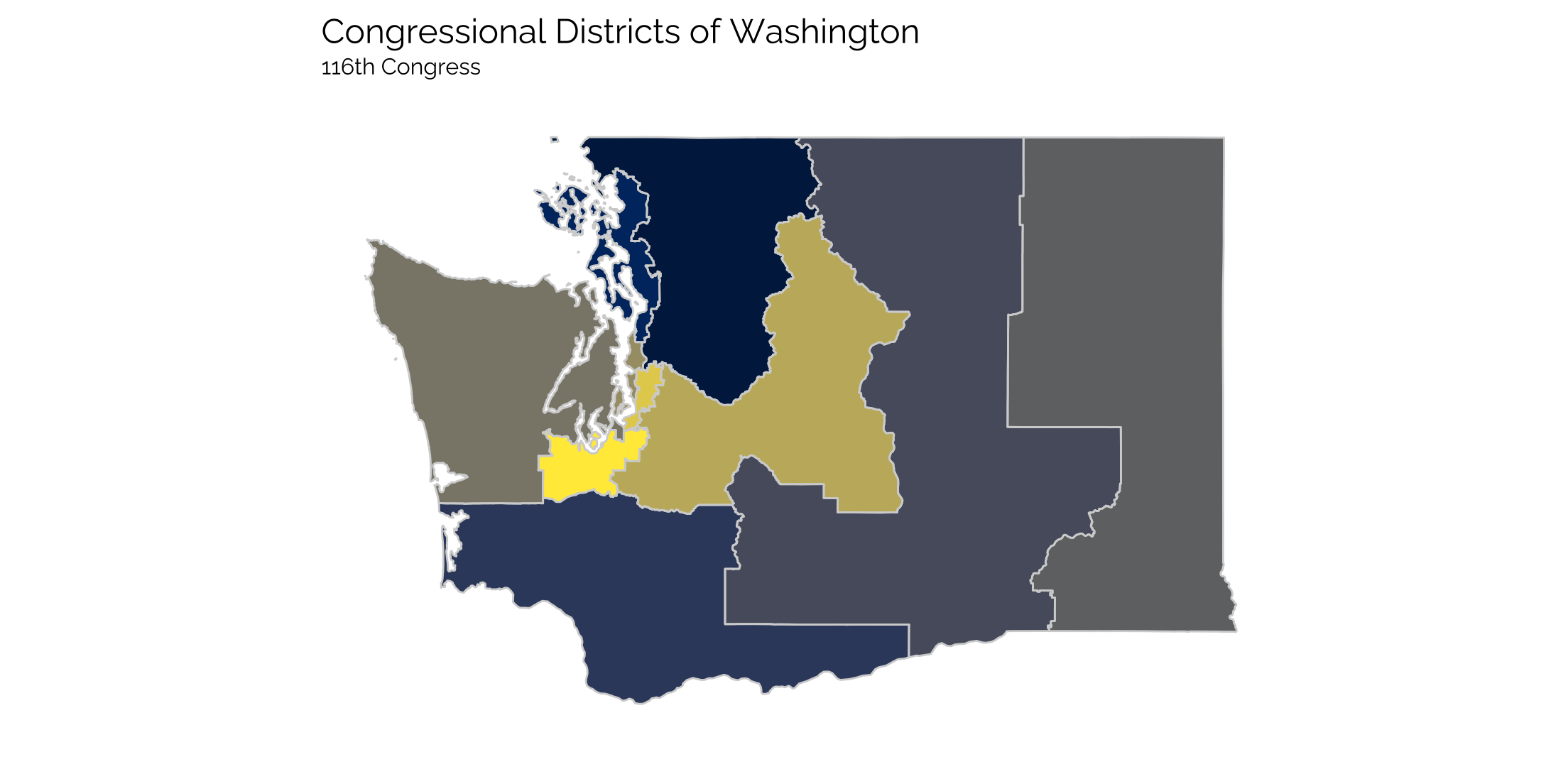
We just read in the data, added an id to the data and then used the fortify() function to convert it into a usable format for ggplot. And now we can plot a map of the districts. In this case, the congressional districts for the state of Washington for the 116th Congress (2019-2021) are plotted. No additional data is added, each district is just assigned a color.
cong_df <- readRDS(here("static", "data", "congress_districts.rds"))

gg_cong <- ggplot(data = subset(cong_df, STATEFP == "53"),
                  aes(x=long, y=lat, group = group, fill = CD116FP)) +
  geom_polygon()  +
  coord_map() +
  geom_path(color = "lightgray") +
  viridis::scale_fill_viridis(option = "E", discrete = TRUE) +
  theme_twg(grid = FALSE) +
  theme(legend.position = "none",
        axis.text.x = element_blank(),
        axis.text.y = element_blank()) +
  labs(title = "Congressional Districts of Washington",
       subtitle = "116th Congress",
       x = "", y = "")

gg_cong