ggplot
Creating my own theme
I’ve borrowed heavily from the hrbrthemes and myriad packages to create a clean theme. If I need to source it, it’s available at github.
devtools::source_url("https://raw.githubusercontent.com/taylorgrant/sandbox/master/theme_twg.R")
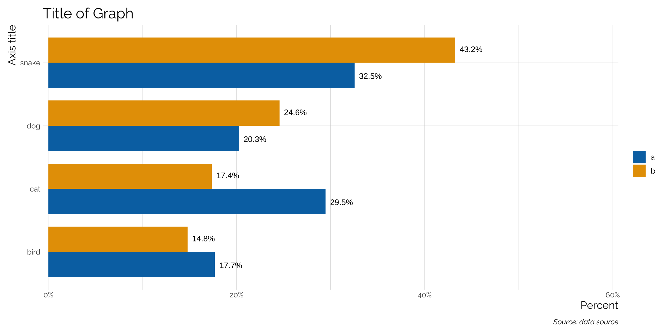
Adding text to barplots with position = “dodge”
With grouped bar charts position = "dodge" is used and the geom_text function also needs to be put into the same position.
set.seed(23)
tibble(type = rep(c('a','b'), each = 4),
         cat = rep(c('cat', 'dog', 'bird', 'snake'),2),
         n = sample(1:500, 8)) %>%
  group_by(type) %>%
  mutate(frac = n/sum(n)) %>%
  ggplot(aes(x = cat, y = frac, group = type,
             fill = type, label = scales::percent(frac))) +
  geom_bar(stat = "identity", position = "dodge", width = .8) +
  coord_flip(ylim = c(0,.6)) +
  theme_twg() +
  hrbrthemes::scale_y_percent() +
  geom_text(aes(x = cat, y = frac,
                label = scales::percent(frac, accuracy = .1)),
            position = position_dodge(.85),
            hjust = -.2,
            size = 3.5) +
  scale_fill_manual(values = my_pal("bly")[c(2,1)], name = "") +
  theme(legend.position = "right") +
  labs(x = "Axis title", y = "Percent",
       title = "Title of Graph",
       caption = "Source: data source")
## Warning: The `size` argument of `element_line()` is deprecated as of ggplot2 3.4.0.
## ℹ Please use the `linewidth` argument instead.
## This warning is displayed once every 8 hours.
## Call `lifecycle::last_lifecycle_warnings()` to see where this warning was generated.
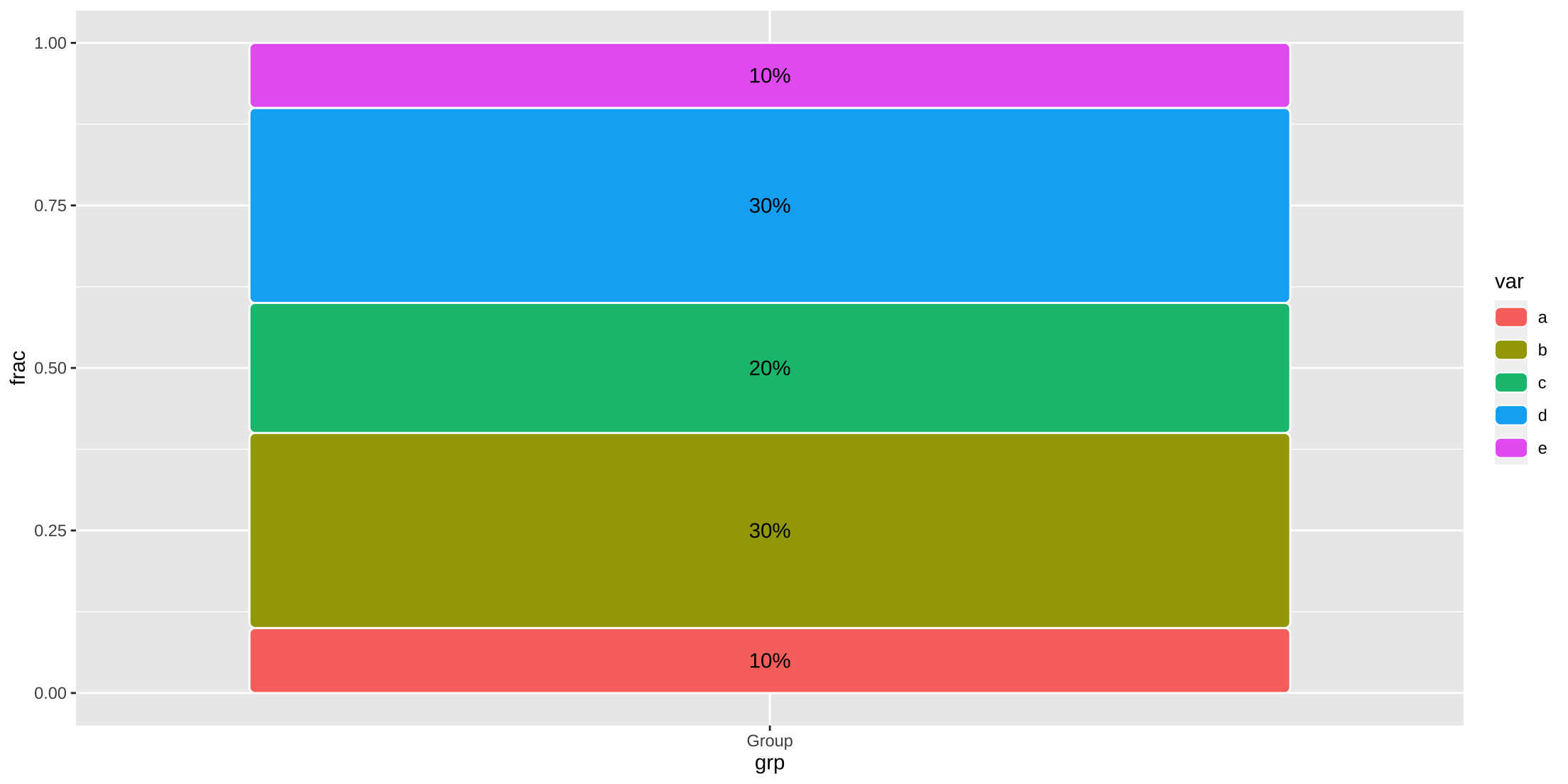
Adding text labels to stacked bar or ggchicklet
geom_chicklet() defaults to reverse = TRUE so have to do it with label as well.
tibble(grp = rep("Group", 5),
       var = letters[1:5],
       frac = c(.1, .3,.2, .3 ,.1)) %>%
  ggplot(aes(x = grp, y = frac, group = var, fill = var)) +
  ggchicklet::geom_chicklet() +
  geom_text(aes(x = grp, y = frac, label = scales::percent(frac)),
            position = position_stack(vjust = .5, reverse = TRUE))
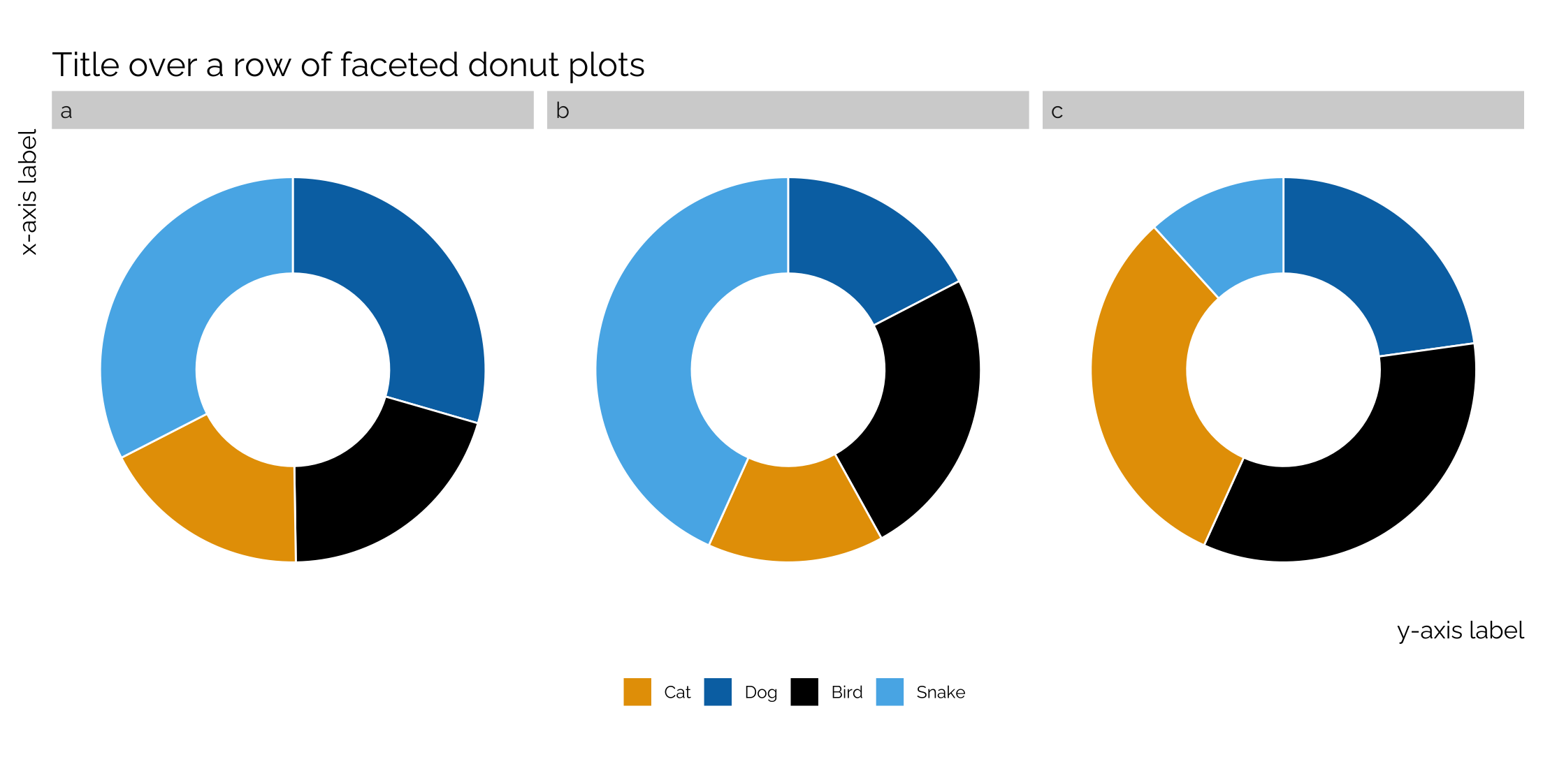
Faceting pie charts and donut plots
Pie charts are generally not that helpful, but occasionally someone wants one. A single pie chart is simple to make in ggplot (see here), but what if you want to facet your pie charts?
This was the old way of having to make pie charts with ggplot and it still works really well.
set.seed(23)
tibble(type = rep(c('a','b', 'c'), each = 4),
         cat = rep(c('cat', 'dog', 'bird', 'snake'),3),
         n = sample(1:500, 12)) %>%
  group_by(type) %>%
  mutate(frac = n/sum(n),
         ymax = cumsum(frac),
         ymin = c(0, head(ymax, n = -1))) %>%
  ggplot(aes(fill = factor(cat), ymax = ymax, ymin = ymin,
             xmax = 8, xmin = 6)) +
  facet_wrap(~type, ncol = 3) + geom_rect(colour = "white", show.legend = TRUE) +
  coord_polar(theta = "y") +
  theme_twg(grid = FALSE) +
  scale_fill_manual(values = my_pal("bly"),
                    labels = c("Cat", "Dog", 'Bird', "Snake"),
                    name = "") +
  theme(legend.position = "bottom",
        panel.grid=element_blank(),
        axis.text.x=element_blank(),
        axis.text.y=element_blank(),
        axis.ticks = element_blank(),
        strip.background =element_rect(fill="lightgray", color = NA)) +
  labs(x = "x-axis label", y = "y-axis label",
       title = "Title over a row of faceted pie charts")
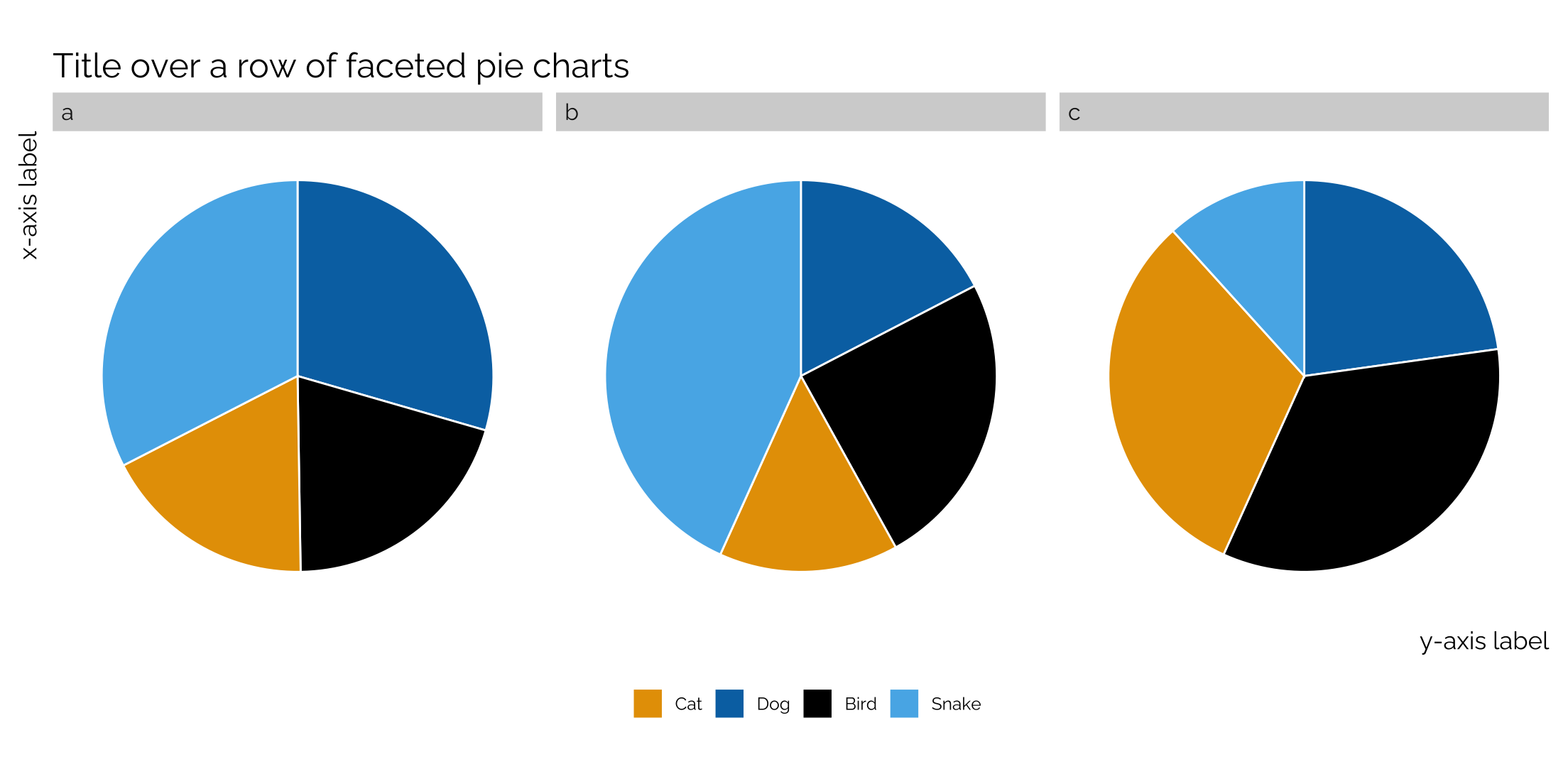
Note that you can turn these pie charts into donut plots by adding xlim(4,8) within the code. The first number decides the thickness of the donut (larger = thicker); the second number dictates the size of the donut (smaller equals larger).
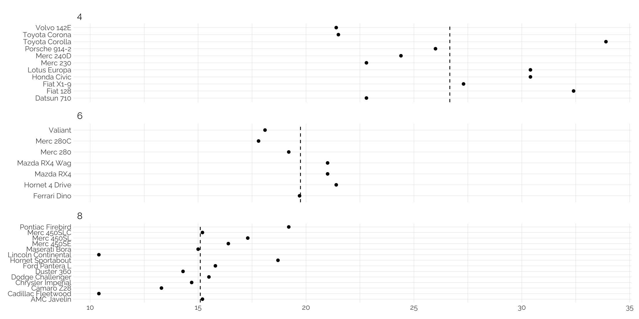
Adding unique lines to facets
We can either create a new dataframe with the specific names of the facets and the values, or we can use an in-block calculation using data = ..
mtcars %>%
  rownames_to_column("model") %>%
  group_by(model, cyl) %>%
  summarize(avg = mean(mpg)) %>%
  ggplot(aes(y=model, x = avg)) +
  geom_point() +
  geom_vline(
    data = . %>%
      group_by(cyl) %>%
      summarise(line = mean(avg)),
    aes(xintercept = line),
    linetype = "dashed"
    ) +
  facet_wrap(~cyl, scales = "free_y", ncol = 1) +
  theme_twg() +
  labs(x = NULL, y = NULL)
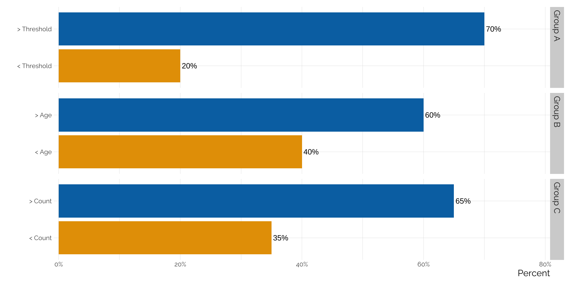
Using facet_grid to graph multiple groups in the same plot
Sometimes you want to make a point about how certain factors are always larger or smaller than another across multiple groups. It can all be plotted out on the same graph, but it’s difficult to draw attention to the groupings - ggplot doesn’t add space between groups on its own. But if we facet by group, we can gain a little breathing room between each group. And by using facet_grid we can rotate the graph.
tibble(group = c('Group A', 'Group A',
                 'Group B', 'Group B',
                 'Group C', 'Group C'),
       fctr = c('< Threshold', '> Threshold',
                '< Age', '> Age',
                '< Count', '> Count'),
       value = c(.2, .7, .4, .6, .35, .65)) %>%
  mutate(order = c(1,2,1,2,1,2)) %>%
  ggplot(aes(x = fctr, y = value, label = scales::percent(value, accuracy = 1),
             fill = factor(order))) +
  geom_bar(stat = "identity") +
  facet_grid(group ~ ., scales = "free_y") +
  coord_flip(ylim = c(0, .8)) +
  hrbrthemes::scale_y_percent() +
  scale_fill_manual(values = my_pal('bly')) +
  geom_text(hjust = -.1) +
  theme_twg() +
  theme(legend.position = 'none',
        strip.background =element_rect(fill="lightgray", color = NA)) +
  labs(x = "", y = 'Percent')
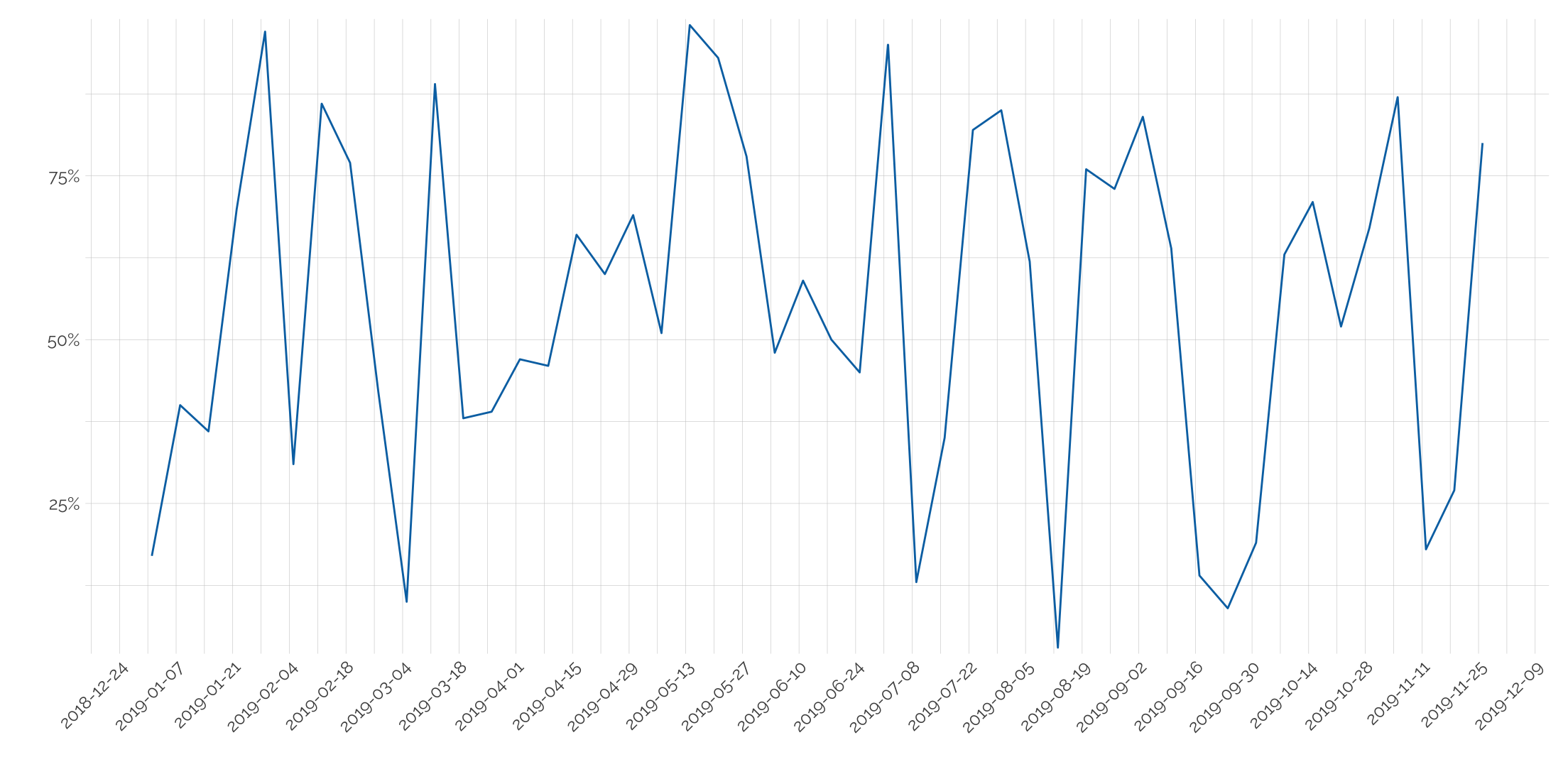
Rotating axis text
Scale the dates being used in the axis with scale_x_date and rotate the label in the them.
tibble(date = seq.Date(as.Date("2019-01-01"), as.Date("2019-12-01"), by = "week"),
       value = sample(1:100, 48)/100) %>%
  ggplot(aes(x = date, y = value)) +
  geom_line(col = my_pal("bly")[2]) +
  scale_x_date(date_breaks = "2 weeks") +
  theme_twg() +
  hrbrthemes::scale_y_percent() +
  labs(x = "", y= "") +
  theme(axis.text.x = element_text(angle = 45, hjust = 1))
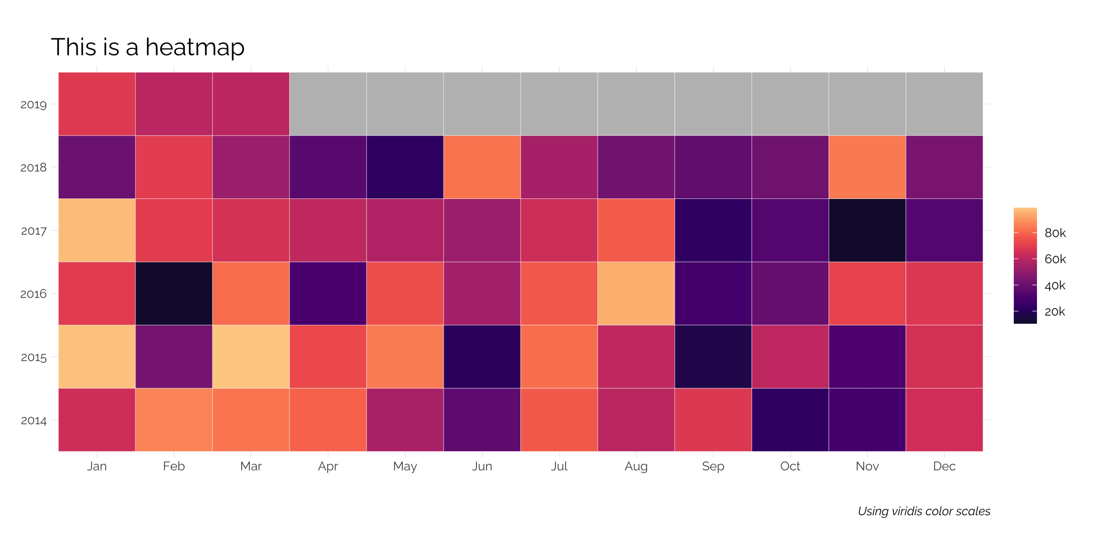
Heatmaps
Heatmaps are simple to make. In this case, we have data at the monthly level with some missing data. Options are used within the fill command to ensure the lower and upper extremes aren’t too dark or light; na.value allows us to change the values of our NA months. Additionally, the plot margins are altered to give more room around the plot while leaving the left margin untouched to give it sense of width.
library(viridis)
tibble(date = seq.Date(as.Date("2014-01-01"), as.Date("2019-12-01"), "month"),
       value = c(sample(10000:100000, 63), rep(NA_integer_, 9))) %>%
  mutate(month = lubridate::month(date, label = TRUE),
         year = factor(lubridate::year(date))) %>%
  ggplot(aes(x = month, y = year, fill = value)) +
  geom_tile(color = "white") +
  scale_fill_viridis(option="magma", begin = .1, end = .9,
                     na.value = "gray",
                     breaks = seq(20000, 100000, 20000),
                     labels = c("20k", "40k", "60k", "80k", "100k")) +
  theme_twg() +
  theme(legend.title = element_blank(),
        plot.margin=unit(c(1,1,1,0),"cm")) +
  labs(x = "", y = "",
       title = "This is a heatmap",
       caption = "Using viridis color scales")
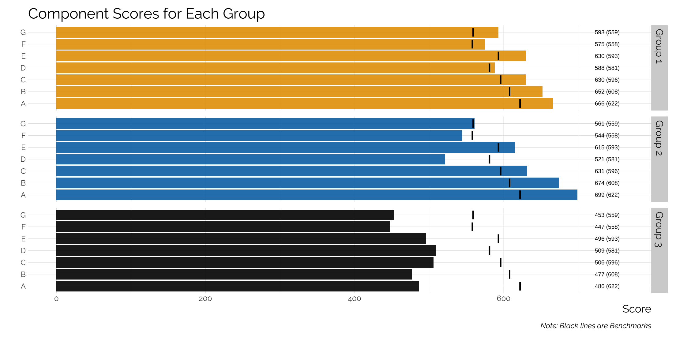
Adding a benchmark to a bar graph
We’ll assume that each bar is a category with a separate benchmark and we’ll have different groups so we’ll also add in facets.
# build a dataset
data <- tibble(component = c("A", "B", "C",
                             "D", "E", "F", "G"),
               g1 = c(666, 652, 630, 588, 630, 575, 593),
               g2 = c(699, 674, 631, 521, 615, 544, 561),
               g3 = c(486, 477,506, 509, 496, 447, 453),
               benchmark = c(622, 608,596,581,593,558,559))

# now graph
data %>%
  gather(group, score, 2:4) %>%
  mutate(group = case_when(group == "g1" ~ "Group 1",
                        group == "g2" ~ "Group 2",
                        group == "g3" ~ "Group 3"),
         score2 = paste0(score, " (", benchmark, ")")) %>%
  ggplot(aes(x = component, y = score, label = score2, fill = group)) +
  geom_bar(stat = "identity",alpha = .9) +
  facet_grid(group ~ .) +
  coord_flip() +
  ylim(c(0, 760)) +
  geom_text(aes(x = component, y = 739),
            size = 2.5) +
  scale_fill_manual(values = my_pal('bly'),
                    name = "") +
  geom_segment(aes(xend = component, yend = benchmark-1, y = benchmark+1),
               size = 5, lineend = "butt", color = "black") +
  theme_twg() +
  theme(strip.background = element_rect(fill="lightgray", color = NA),
        legend.position = "none") +
  labs(x = "", y = "Score",
       title = "Component Scores for Each Group",
       caption = "Note: Black lines are Benchmarks")
## Warning: Using `size` aesthetic for lines was deprecated in ggplot2 3.4.0.
## ℹ Please use `linewidth` instead.
## This warning is displayed once every 8 hours.
## Call `lifecycle::last_lifecycle_warnings()` to see where this warning was generated.
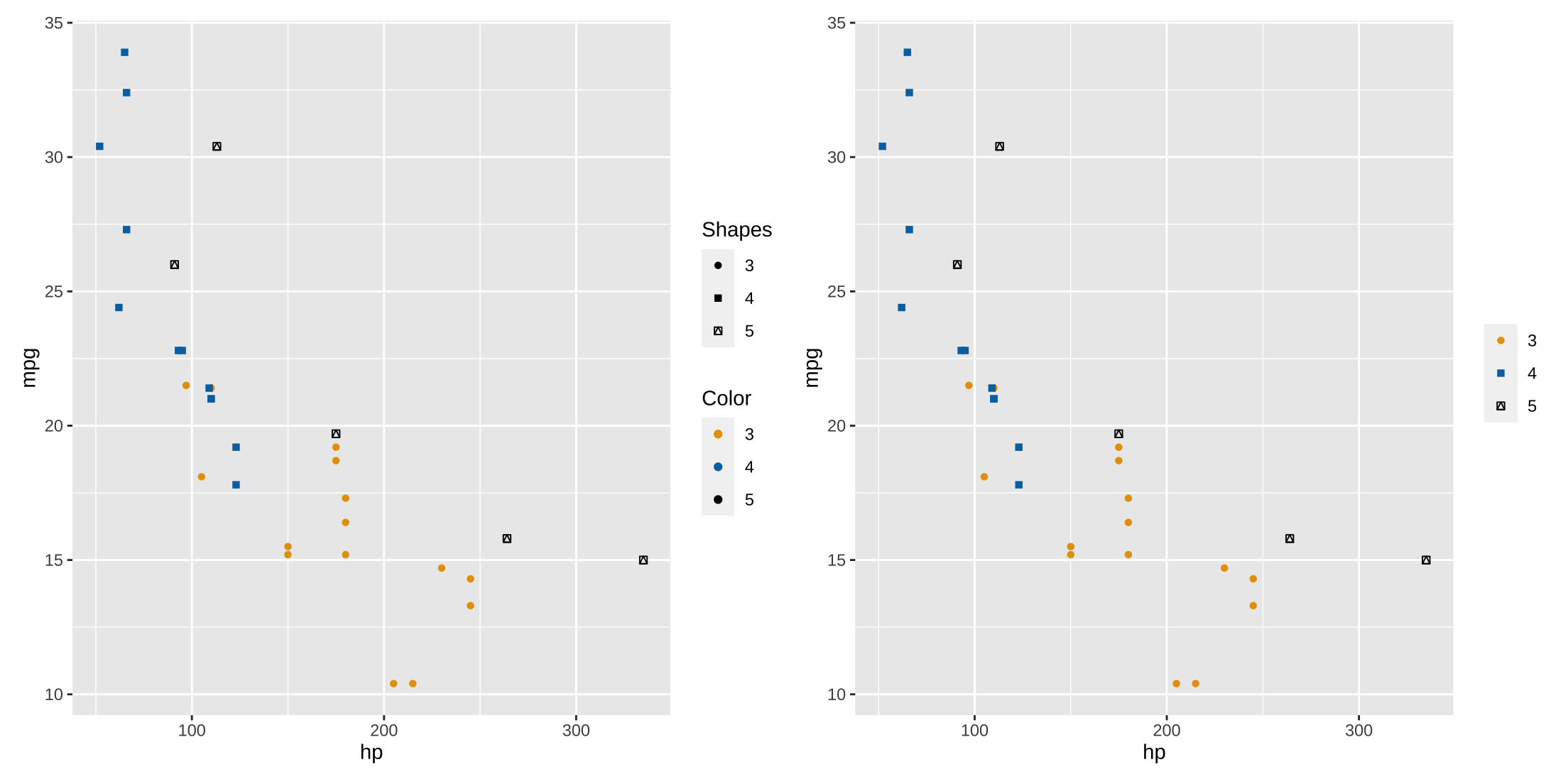
Unifying Legends
If you manually specify colors and add shapes in a scatterplot, two legends are created (left plot). You can unify them by naming them the same thing, or naming them both as NULL (right plot).
library(patchwork)
## Warning: package 'patchwork' was built under R version 4.3.3
p1 <- ggplot(mtcars, aes(x = hp, y = mpg, group = factor(gear),
                         col = factor(gear), shape = factor(gear))) +
  geom_point() +
  scale_color_manual(name = "Color", values = my_pal("bly")) +
  scale_shape_manual(name = "Shapes", values = c(16, 15 ,14))

p2 <- ggplot(mtcars, aes(x = hp, y = mpg, group = factor(gear),
                         col = factor(gear), shape = factor(gear))) +
  geom_point() +
  scale_color_manual(name = NULL, values = my_pal("bly")) +
  scale_shape_manual(name = NULL, values = c(16, 15 ,14))

p1 | p2
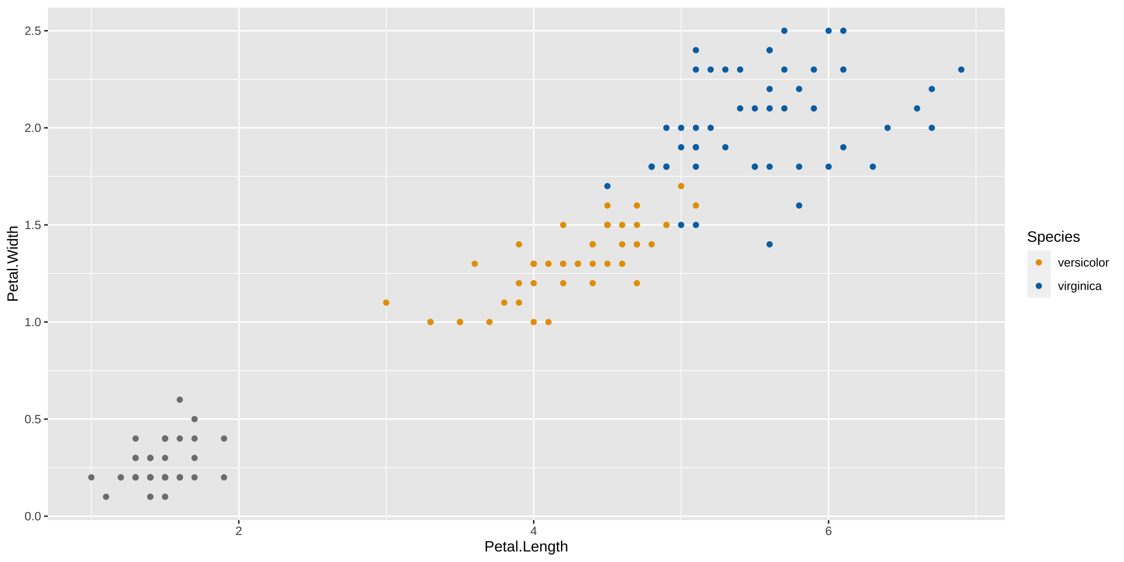
Dropping a series from a legend
Sometimes you want to call attention to some, but not all series in a plot. This is easily done by setting the breaks and labels.
ggplot(iris, aes(x=Petal.Length, y = Petal.Width, group = Species, col = Species)) +
  geom_point() +
  scale_color_manual(values = my_pal("bly"),
                     breaks = c("versicolor", "virginica"),
                     labels = c('versicolor', "virginica"))
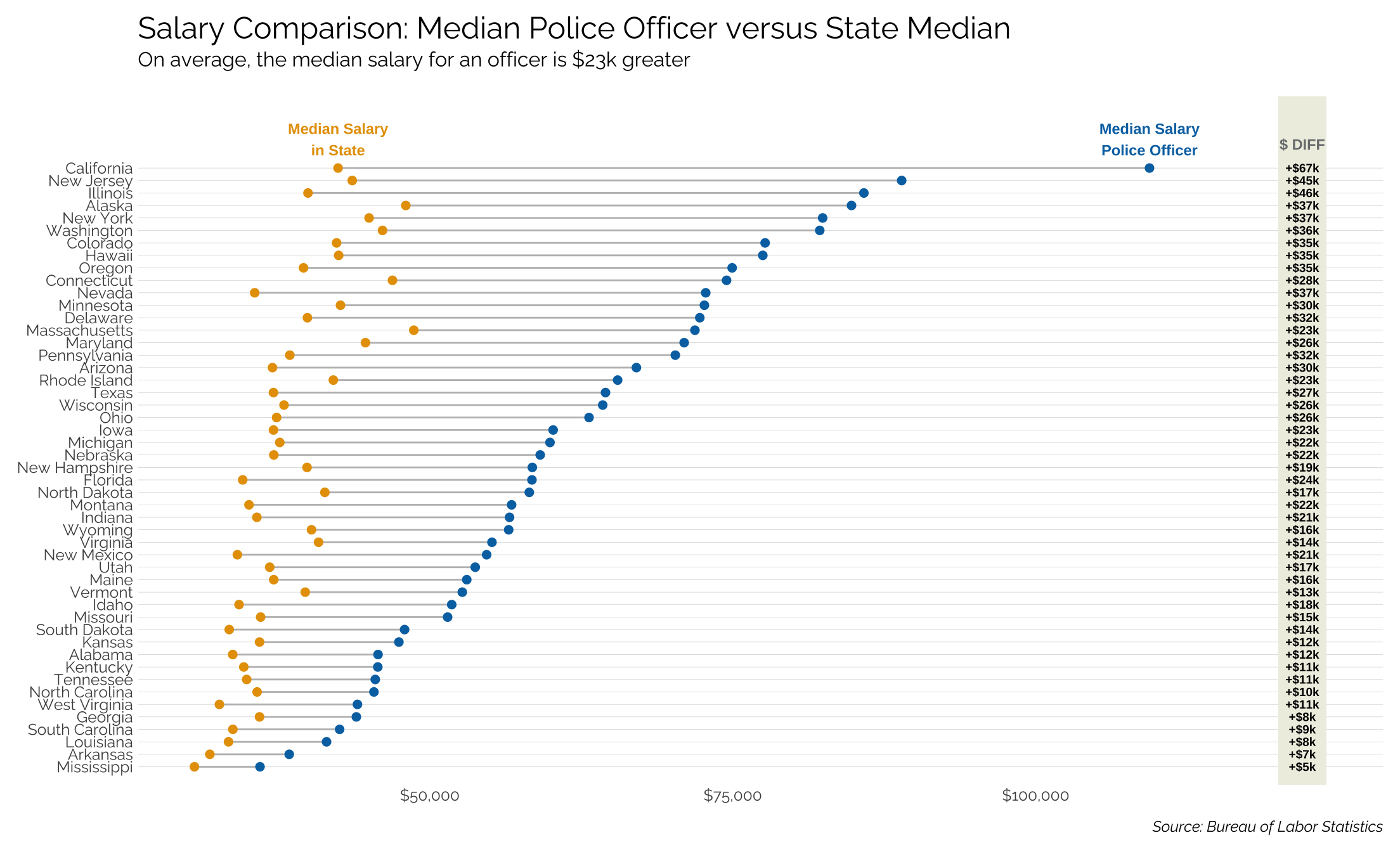
Making a dumbbell plot
Let’s compare the median salary of a police officer in each state to the median salary in that state.
pacman::p_load(tidyverse, readxl, janitor, here, glue, httr, rvest)

## get police officer salary data ##
GET("https://www.bls.gov/oes/special.requests/oes_research_2019_sec_99.xlsx",
    write_disk(path <- tempfile(fileext = ".xlsx")))

tmp <- read_excel(path) %>%
  clean_names()

names(tmp)
cop <- tmp %>% filter(occ_title == "Police and Sheriff's Patrol Officers") %>%
  filter(str_detect(naics_title, "Federal, State")) %>%
  distinct(area, .keep_all = TRUE)

tmp_cop <- cop %>%
  select(area_title, a_median)

tmp_cop %>% filter(area_title == "Oklahoma")

# get median salary from wikipedia
url <- "https://en.wikipedia.org/wiki/List_of_U.S._states_and_territories_by_median_wage_and_mean_wage"

median <- url %>%
  read_html() %>%
  html_nodes(xpath = '/html/body/div[3]/div[3]/div[5]/div[1]/table[2]') %>%
  html_table() %>%
  flatten_df()

# join the medians
tmp_median <- median %>%
  clean_names() %>%
  left_join(tmp_cop, by = c("stateor_territory" = "area_title")) %>%
  filter(!is.na(a_median))

# clean and get the difference
tmp_median <- tmp_median %>%
  mutate(median_wage_in_us_1 = str_replace_all(median_wage_in_us_1, "\\$", ""),
         median_wage_in_us_1 = str_replace_all(median_wage_in_us_1, ",", "")) %>%
  mutate_at(vars(c(median_wage_in_us_1, a_median)), as.numeric)  %>%
  filter(!is.na(median_wage_in_us_1)) %>%
  mutate(diff = a_median - median_wage_in_us_1,
         round(diff),
         diff2 = paste0("+$", round(diff/1000), "k")) %>%
  filter(stateor_territory != "Oklahoma") # oklahoma isn't in the BLS data...

# plot it
ggplot() +
  geom_segment(data = tmp_median,
               aes(x = reorder(stateor_territory, a_median),
                   xend = reorder(stateor_territory, a_median),
                   y = median_wage_in_us_1, yend = a_median),
               color = "gray") +
  geom_point(data = tmp_median, aes(x = reorder(stateor_territory, a_median), y = median_wage_in_us_1),
             color = my_pal("bly")[1], size = 2) +
  geom_point(data = tmp_median, aes(x = reorder(stateor_territory, a_median), y = a_median),
             color = my_pal("bly")[2], size = 2) +
  coord_flip() +
  scale_x_discrete(expand = expansion(mult = c(0.03, 0.12))) +
  scale_y_continuous(labels=scales::dollar_format(prefix="$"),
                     breaks = seq(50000,100000, 25000)) +
  theme_twg(grid = "Y") +
  geom_rect(data = tmp_median,
            aes(ymin=121000, ymax=123000, xmin=-Inf, xmax=Inf),
            fill="#efefe3") +
  geom_text(data=tmp_median,
            aes(label = diff2, x = reorder(stateor_territory, a_median),
                y=122000), fontface="bold", size=2.5) +
  geom_text(data = filter(tmp_median, stateor_territory == "California"),
            aes(x = stateor_territory, y = median_wage_in_us_1,
                label = "Median Salary\nin State"),
            vjust = -.4, size = 3.1, color = my_pal('bly')[1],
            fontface = "bold") +
  geom_text(data = filter(tmp_median, stateor_territory == "California"),
            aes(x = stateor_territory, y = a_median,
                label = "Median Salary\nPolice Officer"),
            vjust = -.4, size = 3.1, color = my_pal('bly')[2],
            fontface = "bold") +
  geom_text(data=filter(tmp_median, stateor_territory == "California"),
            aes(x=stateor_territory, y=122000, label="$ DIFF"),
            color="#7a7d7e", size=3.1, vjust=-1.8, fontface="bold") +
  labs(x = NULL, y = NULL,
       title = "Salary Comparison: Median Police Officer versus State Median",
       subtitle = "On average, the median salary for an officer is $23k greater",
       caption = "Source: Bureau of Labor Statistics")
## Warning in geom_rect(data = tmp_median, aes(ymin = 120000, ymax = 124000, : All aesthetics have length 1, but the data has 49 rows.
## ℹ Please consider using `annotate()` or provide this layer with data containing a single row.
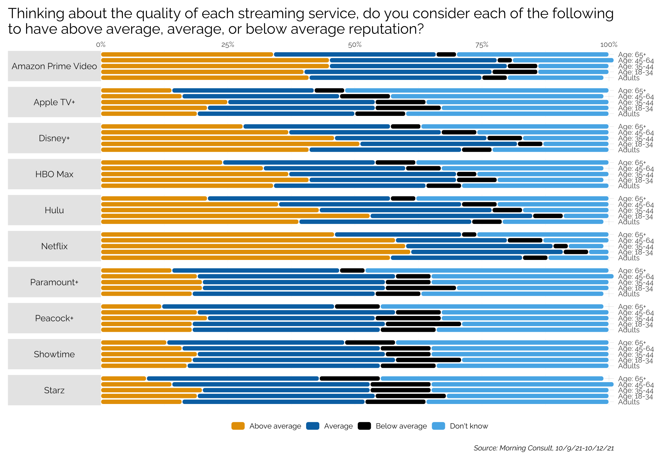
Creating a grouped, faceted, chicklet plot
This uses the ggchicklet package from github.com/hrbrmstr/ggchicklet. In this case, we’ll take some data from a Morning Consult poll that asks people their opinion of the reputation of various streaming services.
library(ggchicklet)
tmp <- readRDS(here("static", "data", "streaming.rds"))
title <- "Thinking about the quality of each streaming service, do you consider each of the following\nto have above average, average, or below average reputation?"
resp <- c("Above average", "Average", "Below average", "Don't know")
lvls <- c("Above average", "Average", "Below average", "Don't know")

tmp %>%
  group_by(Question) %>%
  select(Question, Demographics, contains('pct')) %>%
  gather(response, pct, 3:ncol(.)) %>%
  mutate(pct = pct/100,
         response = str_replace_all(response, "_", " "),
         response = str_trim(str_replace_all(response, "pct", "")),
         response = factor(response, levels = lvls)) %>%
  arrange(Question) %>%
  ggplot(aes(x = Demographics, y = pct)) +
  geom_chicklet(aes(fill = response)) +
  facet_grid(Question~., switch = "y") +
  scale_x_discrete(position = "top") +
  scale_fill_manual(name = NULL,
                    values = my_pal("bly")) +
  coord_flip() +
  theme_twg() +
  hrbrthemes::scale_y_percent(expand = c(0,0), position = "right") +
  guides(fill=guide_legend(nrow=1, byrow = TRUE)) +
  theme(legend.position="bottom",
        axis.text = element_text(size = 9),
        plot.title.position = "plot",
        strip.text.y.left = element_text(angle = 0, size = 11, hjust = .5),
        strip.background = element_rect(fill = "#E8E8E8", color = "#E8E8E8")) +
  labs(x = NULL, y = NULL,
       title = title,
       caption = "Source: Morning Consult, 10/9/21-10/12/21")
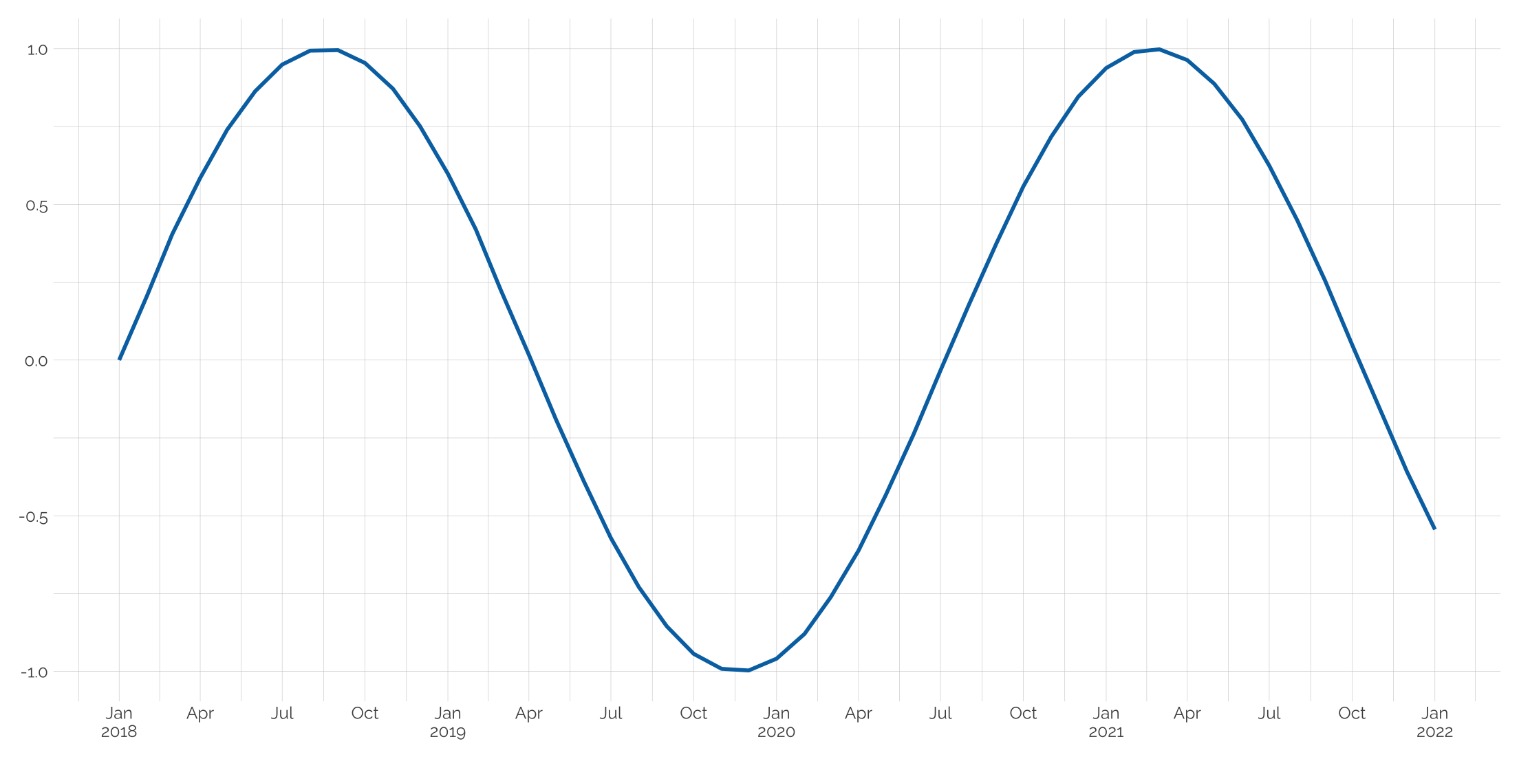
Splitting axis dates into two lines
Dates can take up quite a bit of space on an axis. But we can split out the month and year on separate lines. Here, labels can take a function that uses a simple ifelse logic.
tibble(date = seq.Date(as.Date("2018-01-01"), as.Date("2022-01-01"), by = "month"),
      t = seq(0,10, length.out = 49),
      y = sin(t)) %>%
  ggplot(aes(x = date, y = y)) +
  geom_line(color = my_pal("bly")[2], size = 1) +
  scale_x_date(date_breaks = "3 months",
               labels = function(x) ifelse(lubridate::month(x) == 1,
                                           paste0(lubridate::month(x,label=TRUE),"\n",lubridate::year(x)),
                                           months(x, TRUE))) +
  theme_twg() +
  labs(x = NULL, y = NULL)
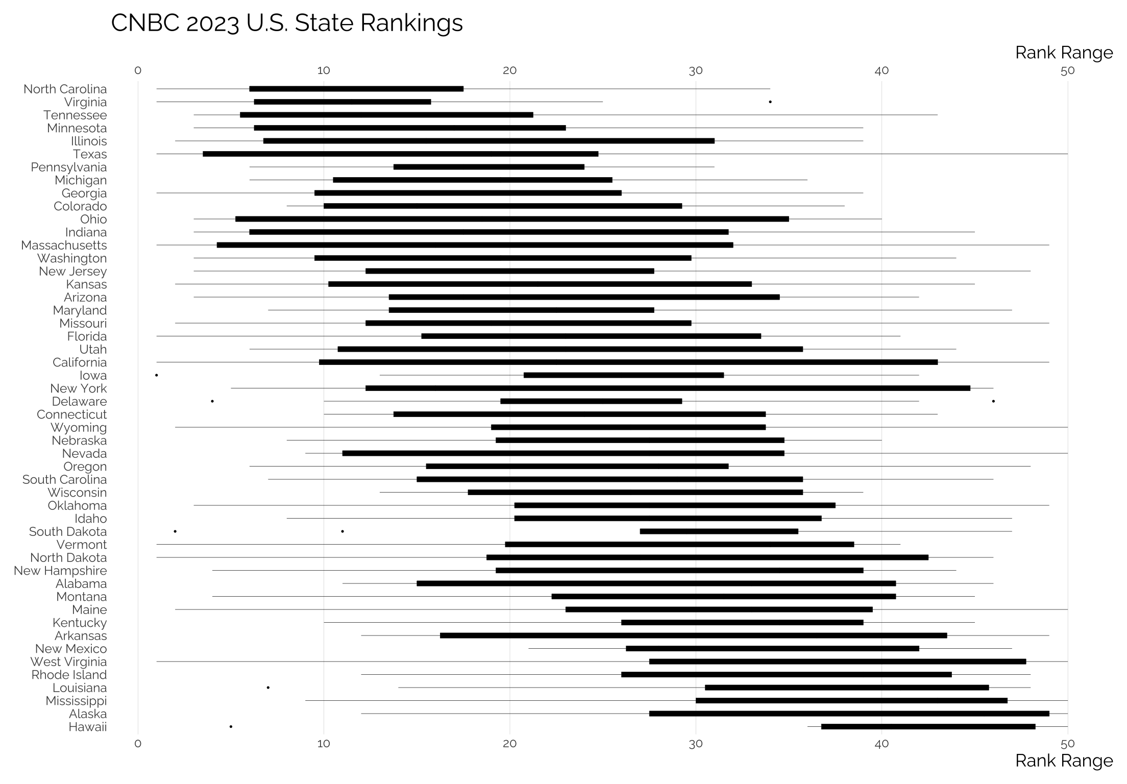
Using boxplots
library(rvest)
pg <- session("https://www.cnbc.com/2023/07/11/americas-top-states-for-business-2023-the-full-rankings.html")

html_node(pg, "table") |>
  html_table() |>
  janitor::clean_names() -> cnbc

cnbc |>
  select(-overall_rank) |>
  gather(measure, value, -state) |>
  mutate(
    state = fct_reorder(state, value, sum) |> fct_rev()
  ) |>
  ggplot() +
  geom_boxplot(
    aes(state, value),
    color = "black", fill = "black",
    linewidth = 0.125, width = 0.4,
    outlier.size = 0.25
  ) +
  scale_y_continuous(sec.axis = dup_axis())+
  coord_flip() +
  labs(
    y = "Rank Range", x = NULL,
    title = "CNBC 2023 U.S. State Rankings"
  ) +
  theme_twg(grid = "X")
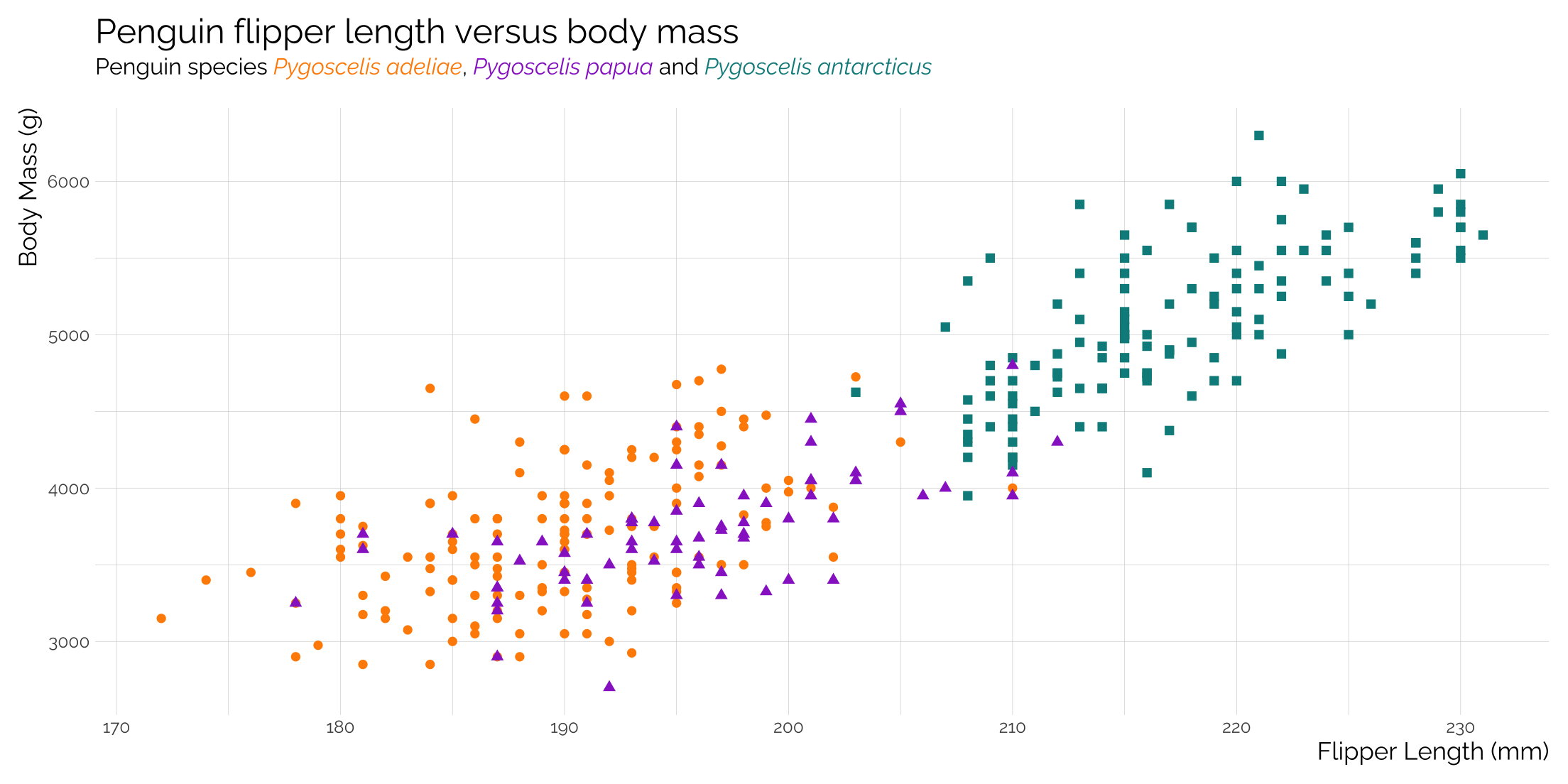
Adding linking colors to plot titles instead of a legend
Using the ggtext package to edit the subtitle via plot.subtitle = element_markdown()
library(ggplot2) # For plotting
library(palmerpenguins) # For the example penguin dataset
library(ggtext) # For HTML rendering of text to support colour
                # Also for Markdown rendering of text

ggplot(data = penguins,
       aes(x = flipper_length_mm,
           y = body_mass_g)) +
  geom_point(aes(color = species,
                 shape = species),
                 size = 2) +
  scale_color_manual(values = c("#FF8C00","#9932CC","#008B8B")) +
  labs(title = "Penguin flipper length versus body mass",
       subtitle = "Penguin species
       <span style='color:#FF8C00;'>*Pygoscelis adeliae*</span>,
       <span style='color:#9932CC;'>*Pygoscelis papua*</span> and
       <span style='color:#008B8B;'>*Pygoscelis antarcticus*</span>",
       x = "Flipper Length (mm)",
       y = "Body Mass (g)")  +
  theme_twg() +
  theme(panel.grid = element_blank(),
        plot.subtitle = element_markdown(),
        legend.position = "none")
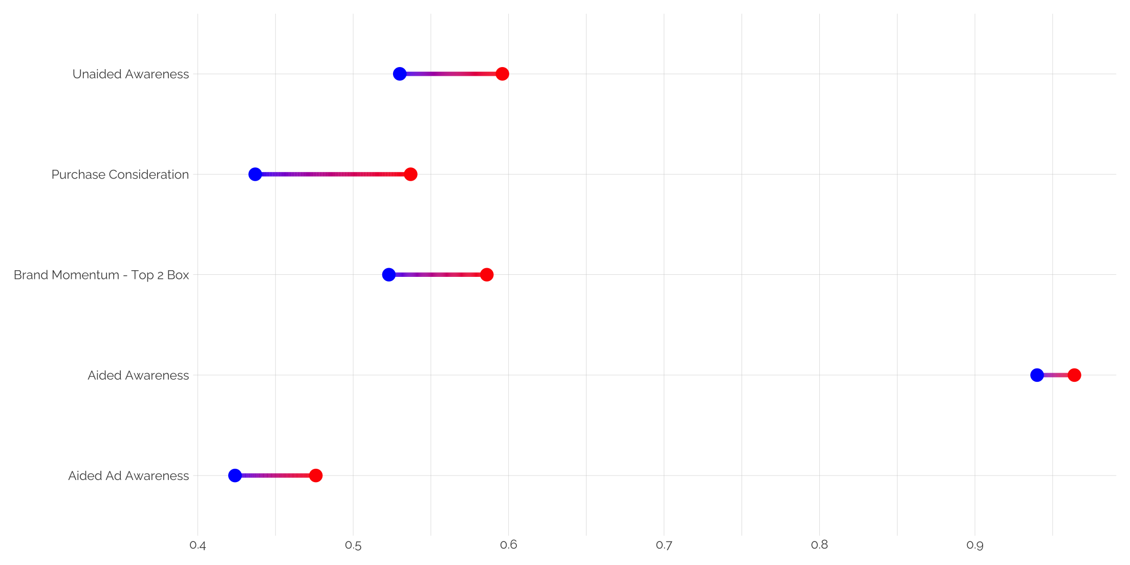
Using gradient segments in a dumbbell plot
Rather than using a single color line segment between points, let’s create a gradient that fits the two dumbbell points.
# function to create the gradient
create_gradient_segment <- function(x, y1, y2, n_points = 100) {
  tibble(
    x = x,
    y = seq(y1, y2, length.out = n_points),
    yend = lead(y),
    value = seq(0, 1, length.out = n_points)  # For color gradient
  ) |>
    na.omit()  # Remove the last NA row from lead()
}

# data frame
df <- tibble(
  Category = factor(c("Unaided Awareness", "Aided Awareness", "Aided Ad Awareness", "Purchase Consideration", "Brand Momentum - Top 2 Box")),
  control = c(0.530, 0.940, 0.424, 0.437, 0.523),
  exposed = c(0.596, 0.964, 0.476, 0.537, 0.586)
)

# Apply the create_gradient_segment to each row of df
segment_data <- df |>
  group_by(Category) %>%
  do(create_gradient_segment(.$Category, .$control, .$exposed)) |>
  ungroup()

# plot with gradient segments
ggplot() +
  geom_segment(data = segment_data, aes(x = x, xend = x, y = y, yend = yend, color = value),
               size = 1.5) +
  geom_point(data = df, aes(x = Category, y = control), color = "blue", size = 4) +
  geom_point(data = df, aes(x = Category, y = exposed), color = "red", size = 4) +
  scale_color_gradient(low = "blue", high = "red", guide = "none") +
  coord_flip() +
  theme_twg() +
  labs(x = NULL, y = NULL)